Overview/Study Area:
For this lab we were required to use the image processing Pix4D to process some of the images that we took earlier in the semester. Pix4D is an image processing software that specializes in image mosaicking and the rendering of 3D images. This lab is designed to show us how to use the software as well as the various tools that you can use within and the exported images that you can receive. We received multiple rasters from this software from two different cameras, GEMS and the SX260.
The study area was located at the soccer fields south of Hamilton Road and southwest of Bollinger Fields (Figure 1). During the flight the class was located west of the study area in a location called home base (Figure 2).
 |
| Figure 1: Aerial locating the study in relation to UWEC and Bollinger Fields |
 |
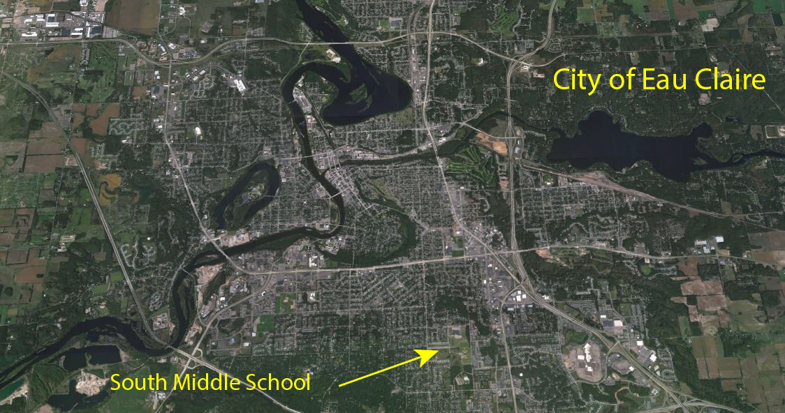
Figure 2: Aerial locating the study area in relation to our home base
|
Workflow:
There are a few things that we need to know about the software before we can dive into it. We must know that you have to obtain at 75% image overlap before you begin processing your imagery or you will not receive accurate results. This is something that you have to take into consideration when you start your mission planning process. Speaking of Mission Planner, you must also consider that if your project is going to require you to take images on multiple days (which means multiple flights) that you fly on days where the weather and lighting is relatively similar to each other so you don't have two image sets where the contrast is too severe between them. It is also recommended that when you fly over areas that are fairly flat in comparison to the height of the objects around that you have the correct exposure settings set so that you achieve more contrast that can distinguish some features from others.
One aspect and advantage of UAS is the option of using GCPs or Ground Control Points. If you would like to learn more about GCPs you can look at my previous blog found here:
http://nikandersonuas.blogspot.com/2015/10/gathering-ground-control-points.html
Now although Pix4D doesn't require that you use GCPs, it is highly recommended as it will increase the accuracy of your projects significantly.
One very helpful immediate export that Pix4D provides is a quality report. This quality report is quite useful because it gives the processor some statistics and some understanding of how the project was processed. It gives a preview of the mosaic as well as a run through of all the steps in the analysis and how they were computed. This can be essential as it can act as some form of metadata which will help others understand how your project was processed.
Knowing what now have learned, we can dive into the processing of our images. We had to process both the GEMS imagery and the SX260 imagery. It was relatively the same process for both of these datasets, except the SX260 was not georeferenced. Anyways to start off we had to open up Pix4D, start a new project, and then select our images (Figure 3). When selecting the images you need to be careful because if you select too many images your processing time is going to increase immensely and it could call for a long night in the lab.
 |
| Figure 3: Screenshot showing the image selection process |
Once you selected your images however, you could move on to the next step which is setting up the properties of your images (Figure 4). In this step you will check the coordinate system, see how many of your images are georeferenced and select your camera model if the software didn't already do so for you. This is where you run into some trouble with the SX260 imagery. None of the images had an x,y, or z associated with them so we had to import a .txt file that had all of the information for us. You have to still be careful however, because you must also select what format your .txt file is in. For example, our .txt file was in the format labeled longitude, latitude, and elevation. This is different from the conventional method of lat, long, and elevation. So if you were to select the wrong option your entire project would be flawed. You also must go into the camera setting and make sure that all the information about your camera is correct (pixel size, focal length, etc.).
 |
| Figure 4: Screenshot showing the properties of the selected images I am about to process |
Once you have accomplished all of these tasks you can move on through the wizard and begin your processing. Now my total processing time for both the datasets probably took just under an hour in our high speed lab. This is quite fast considering that sometimes you may have to let it run overnight. The resulting images are shown below in Figures 5-7.
 |
| Figure 5: The immediate result of the processing gives a ray cloud of all our images in a three dimensional plane |
 |
| Figure 6: Once we turn on the point cloud we can see the final mosaicked imagery as shown in this example of the GEMS imagery |
 |
| Figure 7: This is an example of the processed SX260 imagery shown from a top down view in which you can see the actual single images that were used in the mosaic. |
From the images above you can see a variety of quality outputs. The GEMs gives us a very high quality image that is not spotty and has a very good high pixel definition. The SX260 on the other hand is not as high definition and is very spotty. You can see that there are many blank spots in the mosaic and that gives us a rather poor quality result. Now, to be fair, we did not have as many images from the SX260 to select from so maybe more images would increase the overlap and therefore increase the quality of our mosaic.
Now we were tasked to do some analysis of the imagery. We needed to calculate the area of a surface, the length of a linear feature, and the volume of an object. To do this we simply went through the ray cloud editor and in the upper right there was three icons that allowed us to do calculations within the software. For the linear feature I did the width of the junior soccer field which ended up being 12.69 meters, for the surface area I did the area of those same fields which ended being 327.64 meters, and for the volumetric object I did the large pavilion which ended up being 134.46 meters cubed. After running the calculations I could export them as shapefiles and import them into Arc, the resulting map is shown below in Figure 8.
 |
| Figure 8: Map showing the locations of my measurements mad through the Pix4D software |
One really neat aspect of the software is that it automatically creates an export package that is saved to our folders. This folder structure is set up so that you have many different outputs of information and data. The files we cared about were the tiffs that gave us an RGB image and a DSM. The DSM or Digital Surface Model gives us the actual representation of the earths surface features. So it includes the pavilion and all the soccer nets. Using these two exports together we can import them into ArcMap and ArcScene and receive a variety of 2D and 3D maps as shown in Figures 9-10 below.
 |
| Figure 9: A side by side comparison of the GEMs vs the SX260 as well as the RGB images and the DSM images for each |
 |
| Figure 10: A side by side comparison of the GEMs vs the SX260 shown in 3D as a resulting map in ArcScene |
Critique/Discussion:
You can see what I believe to be a distinct difference between the two datasets that we processed in Pix4D. The most obvious difference is when you look at the DSM elevation maps and see that they do not line up. The GEMs is displayed with low elevations at the sides working up to the top of a hill where the pavilion then stands above the rest. The SX260 shows a gradual decrease in slope from right to left with the pavilion in the middle not standing out at all. I believe the GEMs to be the more accurate of the two and I am actually astounded by the result of the SX260 processing, not only is it not accurate but it does not even come close to what is realistic. You can also see this by looking at the 3D maps that I made in ArcScene. Look closely and you can tell how the slope falls with these two images, the GEMs in my opinion looks much better.
Now the question is, is that the cameras fault, the users fault, or the software's fault. I believe the fault lies among all three components. I cant blame Pix4D because they were not given a lot of images to work with for the SX260. As a user of the camera, we could have set it up differently so that it took more images over our study area but at the same time, if the camera had a wider overlap then it is possible that this would never have been an issue. The Pix4D software did a great job in using what it had and still being able to make as good of a mosaic as it was able to.
One last feature of Pix4D is that it allows you to create an animation that gives someone a first person tour of your mosaic. This is great and can really capture your audience if you are given a presentation on a certain cite. It was a quick process that was VERY easy and I will be ending this blog by showing you the very video I made. Enjoy...