Monday, December 7, 2015

Volumetrics

Introduction:
Using UAS and the resulting DSMs we can get from UAS imagery we can run many analytical tools. One of the more practical reasons for using UAS is calculating volumetrics. The need for volumetrics can be found in many places but we are focusing mainly on calculating the volume of frac sand in piles throughout a mine. This information can be invaluable to the mining company as they can now know how many cubic meters of sand they are moving each day. This process can be done one of three ways, all of which I will touch on in this blog.

Methods:
To test out the three methods we selected three aggregate piles to use for analysis on all three methods. To begin we started with the Pix4D method which consisted of running the photos through the processing software and then going back through and drawing polygons around the piles so that the software can calculate the volumetrics by using the DSM that was just created. The piles were numbered 1-3 from left to right (Figures 1,2,3,and 4).

Figure 1: Example of the selection that we drew around each Polygon to calculate the volume

Figure 2: Screenshot of the First pile polygon


Figure 3: Screenshot of the Second pile polygon
Figure 3: Screenshot of the Third pile polygon


The next method was through ArcMap and consisted of calculating the volume through the use of a surface volume. For this we had to extract by clip the area around the sand piles so that we had a specific clip of the sand piles but still in raster format. The next step was to calculate the elevation of the top of each of the piles so we had that data for the volume tool. Once we had this surface all set up, we ran the surface volume tool and got the following values listed below in Figures 4-6.


Figure 4: Screenshot of the first surface volume

Figure 5: Screenshot of the second surface volume
Figure 6: Screenshot of the third surface volume

The final to calculate volume is through creating a TIN and using the polygon volume tool. To do this we first had to take the raster (DSM) and run a raster to TIN tool (Figure 7) so we could have our Triangular Irregular Network. We also had to add the mean surface elevation as a Z value before finishing the process. However, once we did that we could run the polygon volume tool to come up with the resulting table below (Figure 8).
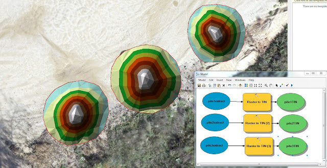
Figure 7: Screenshot of our three piles in the TIN format with a sideshot of our data flow model showing the part of the process into making the raster a TIN
Figure 8: Screenshot of all three of the TIN/polygon volumes

Results/Discussion:
We can see from these three derivatives of volume models that they are not consistent and vary quite a bit (Figure 9). This is most likely the result of user error. These values look incorrect to me as the with the actual size of the sand piles there is no way that they are only 10 meters cubed. But regardless, for right now its all about the process, not the product. The Pix4D was confusing but should be the most accurate since we are doing it right in their software and they only calculate the volume of the pile, not the surrounding flat areas around the pile. Raster surface is great but you need a baseline flat surface in order to calculate its volume. This is because it takes the surface of the pile but we give it a baseline elevation value and if that elevation is wrong or not constant throughout the whole object, then it will be invariably incorrect. Finally with TIN you can see from Figure 10 below that it can be the longest process but you can also see from the values chart that the three piles we calculated had the closest relation to each when using the TIN. You can have the same problem with the TIN as you did the Raster Surface, if you don't add the surface information correctly, this will invariably corrupt your data accuracy.
Figure 9: Table showing all three methods put together

Figure 10: Screenshot of my data flow model used to calculate the TIN volume in the last method.

Conclusion:
What I can take away from this is that in many aspects of Geospatial technology there can be different ways of collecting data and running through processes. It is up to the geographer to take these different methods and realize which methods are more accurate and which methods are better for different applications. Just because you have an object that you need to calculate the volume on doesn't mean that you can use all of these methods but you can most likely use at least one and knowing how to differentiate between the three is the name of the game and what can separate a basic geographer from an exquisite one.


Sunday, November 15, 2015

Adding GCPs to Pix4D Software

Overview/Study Area:
The purpose of this lab is to demonstrate the advantages of Ground Control Points or GCPs when doing image processing. To do this we first ran a dataset of 342 photos that we took earlier in the semester in Pix4D without any GCPs. Once this was done running, we then ran the same dataset but this time with GCPs so we could compare accuracy and results. This will give us an idea of how important these GCPs really are and why they should be implemented into all aspects of image processing.

Our area of interest of this dataset was two small drainage ponds south of South Middle School (Figure 1). The South Middle School community garden was just to the North of our study area and we set up home base at the Northwest corner (Figure 2). We conducted this small study on September 30th from 4-7pm.
Figure 1: South Middle School is located south of Highway 12 and west of Highway 93


Figure 2: Map showing where our home base and study area were in relation to South Middle School


Workflow:
The basis of this activity is in the use of the software, however it is important to note that this would not have been possible without first collecting the GCPs and gathering the imagery. If you would like to know more about how we went about the collection of this data then you can look at my blog here: http://nikandersonuas.blogspot.com/2015/10/gathering-ground-control-points.html
Since this blog is focused on adding the GCPs I will also abstain from going in depth about the Pix4D software, but once again if you would like to learn more about Pix4D and how they process imagery, you can read my blog here http://nikandersonuas.blogspot.com/2015/11/pix4d-processing-and-analysis.html

Now that you have an idea of how we collected the GCPs and how the software works, we can dive into the addition of GCPs into our workflow so we can demonstrate the benefit of having them. We start the process the same as if we didn't have any GCPs. So basically adding the photos, checking the coordinate system, making sure our images are geolocated. Once we have everything set up to process we then go to the tie point manager and begin the process off adding the GCPs. We do this by importing a file that has the latitude, longitude, and elevation of our GCPs. This finds the images in which those coordinates exist and gives them to us in a list form. We then go through that list and begin the tedious process of selecting the middle of our GCP in the image with a click of the mouse. Every click that we make then makes the process a little easier and the software begins to narrow down where the exact location of the GCP is located. I manually selected around 9 or 10 images for each GCP and let the software automatically correct itself and pick the others. Each time I was done selecting images for a GCP, I would optimize that GCP which would run a tool that selected even more pictures for each GCP (Figure 3).
Figure 3:A screenshot of the GCP selection process of which I would then optimize.
Once I was done selecting all the GCPs it was no more then a matter of pressing start and letting the software do its thing. It would take around 2-3 or more hours for this dataset to complete processing. After the process is completed we received a quality report letting us know all of the information associated with the processing of this dataset.

Discussion/Critique

Overall I think the software is once again very easy to use. It is a little tedious to select all the images for the GCPs but once you do that, you are going to end up with a much better and more accurate product. In Figure 4 below you can see my final orthomosaic that I created in ArcMap from the processing that was done in Pix4D.
Figure 4: Map showing the final result of the GCP version of the Pix4D processing.

As you look at the image above you can see a very high definition mosaic that it is geometrically othrorectified by the GCPs.  To see a true comparison of this image without the help of GCPs, look at Figure 5 below.
Figure 5: Look closely at this image and you can see that I made the image on top transparent.
 What you are seeing here is a comparison of the GCP ortho and the Non GCP ortho on top. If you just need an image to look at you would never tell the difference but when you lay them side by side you can see that they are completely off. This would become a big deal if we were dealing with volumetrics in mining where companies would want a very accurate reading of how much they extracting out. This is the real reason why you want to continually use GCPs when conducting analysis with UAS. Pix4D is a very reliable software to use as it is for the most part self explanatory and it is also very accurate and gives us a great final product.


Monday, November 9, 2015

Pix4D Processing and analysis

Overview/Study Area:
For this lab we were required to use the image processing Pix4D to process some of the images that we took earlier in the semester. Pix4D is an image processing software that specializes in image mosaicking and the rendering of 3D images. This lab is designed to show us how to use the software as well as the various tools that you can use within and the exported images that you can receive. We received multiple rasters from this software from two different cameras, GEMS and the SX260.

The study area was located at the soccer fields south of Hamilton Road and southwest of Bollinger Fields (Figure 1). During the flight the class was located west of the study area in a location called home base (Figure 2).
Figure 1: Aerial locating the study in relation to UWEC and Bollinger Fields


Figure 2: Aerial locating the study area in relation to our home base


Workflow:
There are a few things that we need to know about the software before we can dive into it. We must know that you have to obtain at 75% image overlap before you begin processing your imagery or you will not receive accurate results. This is something that you have to take into consideration when you start your mission planning process. Speaking of Mission Planner, you must also consider that if your project is going to require you to take images on multiple days (which means multiple flights) that you fly on days where the weather and lighting is relatively similar to each other so you don't have two image sets where the contrast is too severe between them. It is also recommended that when you fly over areas that are fairly flat in comparison to the height of the objects around that you have the correct exposure settings set so that you achieve more contrast that can distinguish some features from others.

One aspect and advantage of UAS is the option of using GCPs or Ground Control Points. If you would like to learn more about GCPs you can look at my previous blog found here: http://nikandersonuas.blogspot.com/2015/10/gathering-ground-control-points.html
Now although Pix4D doesn't require that you use GCPs, it is highly recommended as it will increase the accuracy of your projects significantly.

One very helpful immediate export that Pix4D provides is a quality report. This quality report is quite useful because it gives the processor some statistics and some understanding of how the project was processed. It gives a preview of the mosaic as well as a run through of all the steps in the analysis and how they were computed. This can be essential as it can act as some form of metadata which will help others understand how your project was processed.

Knowing what now have learned, we can dive into the processing of our images. We had to process both the GEMS imagery and the SX260 imagery. It was relatively the same process for both of these datasets, except the SX260 was not georeferenced. Anyways to start off we had to open up Pix4D, start a new project, and then select our images (Figure 3). When selecting the images you need to be careful because if you select too many images your processing time is going to increase immensely and it could call for a long night in the lab.
Figure 3: Screenshot showing the image selection process
 Once you selected your images however, you could move on to the next step which is setting up the properties of your images (Figure 4). In this step you will check the coordinate system, see how many of your images are georeferenced and select your camera model if the software didn't already do so for you. This is where you run into some trouble with the SX260 imagery. None of the images had an x,y, or z associated with them so we had to import a .txt file that had all of the information for us. You have to still be careful however, because you must also select what format your .txt file is in. For example, our .txt file was in the format labeled longitude, latitude, and elevation. This is different from the conventional method of lat, long, and elevation. So if you were to select the wrong option your entire project would be flawed. You also must go into the camera setting and make sure that all the information  about your camera is correct (pixel size, focal length, etc.).
Figure 4: Screenshot showing the properties of the selected images I am about to process
 Once you have accomplished all of these tasks you can move on through the wizard and begin your processing. Now my total processing time for both the datasets probably took just under an hour in our high speed lab. This is quite fast considering that sometimes you may have to let it run overnight. The resulting images are shown below in Figures 5-7.
Figure 5: The immediate result of the processing gives a ray cloud of all our images in a three dimensional plane
Figure 6:  Once we turn on the point cloud we can see the final mosaicked imagery as shown in this example of the GEMS imagery
Figure 7: This is an example of the processed SX260 imagery shown from a top down view in which you can see the actual single images that were used in the mosaic.
From the images above you can see a variety of quality outputs. The GEMs gives us a very high quality image that is not spotty and has a very good high pixel definition. The SX260 on the other hand is not as high definition and is very spotty. You can see that there are many blank spots in the mosaic and that gives us a rather poor quality result. Now, to be fair, we did not have as many images from the SX260 to select from so maybe more images would increase the overlap and therefore increase the quality of our mosaic.

Now we were tasked to do some analysis of the imagery. We needed to calculate the area of a surface, the length of a linear feature, and the volume of an object. To do this we simply went through the ray cloud editor and in the upper right there was three icons that allowed us to do calculations within the software. For the linear feature I did the width of the junior soccer field which ended up being 12.69 meters, for the surface area I did the area of those same fields which ended being 327.64 meters, and for the volumetric object I did the large pavilion which ended up being 134.46 meters cubed. After running the calculations I could export them as shapefiles and import them into Arc, the resulting map is shown below in Figure 8.

Figure 8: Map showing the locations of my measurements mad through the Pix4D software
One really neat aspect of the software is that it automatically creates an export package that is saved to our folders. This folder structure is set up so that you have many different outputs of information and data. The files we cared about were the tiffs that gave us an RGB image and a DSM. The DSM or Digital Surface Model gives us the actual representation of the earths surface features. So it includes the pavilion and all the soccer nets. Using these two exports together we can import them into ArcMap and ArcScene and receive a variety of 2D and 3D maps as shown in Figures 9-10 below.
Figure 9: A side by side comparison of the GEMs vs the SX260 as well as the RGB images and the DSM images for each

Figure 10: A side by side comparison of the GEMs vs the SX260 shown in 3D as a resulting map in ArcScene
Critique/Discussion:
You can see what I believe to be a distinct difference between the two datasets that we processed in Pix4D. The most obvious difference is when you look at the DSM elevation maps and see that they do not line up. The GEMs is displayed with low elevations at the sides working up to the top of a hill where the pavilion then stands above the rest. The SX260 shows a gradual decrease in slope from right to left with the pavilion in the middle not standing out at all. I believe the GEMs to be the more accurate of the two and I am actually astounded by the result of the SX260 processing, not only is it not accurate but it does not even come close to what is realistic. You can also see this by looking at the 3D maps that I made in ArcScene. Look closely and you can tell how the slope falls with these two images, the GEMs in my opinion looks much better.

Now the question is, is that the cameras fault, the users fault, or the software's fault. I believe the fault lies among all three components. I cant blame Pix4D because they were not given a lot of images to work with for the SX260. As a user of the camera, we could have set it up differently so that it took more images over our study area but at the same time, if the camera had a wider overlap then it is possible that this would never have been an issue. The Pix4D software did a great job in using what it had and still being able to make as good of a mosaic as it was able to.

One last feature of Pix4D is that it allows you to create an animation that gives someone a first person tour of your mosaic. This is great and can really capture your audience if you are given a presentation on a certain cite. It was a quick process that was VERY easy and I will be ending this blog by showing you the very video I made. Enjoy...


Tuesday, October 20, 2015

GEMs Review

Overview:
The Geo localization and Mosaicing System or GEMs for short is a precision agriculture multispectral sensor payload that be used on many different UAS platforms. This sensor was designed to capture RGB, NIR, and NDVI imagery in NADIR. With the purchase of the GEMs hardware, you also receive the GEMs software package as well. This software allows you to process the imagery that you just took and automatically receive orthomosaiced RBG, NIR, and NDVI imagery.

Workflow:
To achieve the final product imagery, there are multiple steps that need to be taken. First, you must mount the sensor to the UAS platform. Whether this be a fixed wing or a multicopter, one important thing to note, the positive charge must be connected to the positive connector. Not doing this on a conventional power system could result in the failure of the hardware or a fire. Once you have the sensor hooked up you must insert a SanDisk extreme 32gb usb jump drive. This is how the GEMs stores its data when in flight.

Now you must consider what the Ground Sampling Distance (GSD) is as well as the Pixel Resolution. This is an important aspect of collecting imagery because you don't want your pixel size to be so large that it doesn't even distinguish separate features that you are trying to study. The GEMs has a GSD of 5.1cm at 400 feet or 2.5cm at 200 feet. The pixel resolution is 1.3MP for both RGB and Mono which comes out to be 1280x1024. Something else that you must take into consideration are all the parameters of mission planning. All these different parameters all relate the quality of the data, but also the efficiency of the platform to accomplish the task at hand. Here are some of the parameters of the GEMs:

Image Sensor resolution: 1280 x 960 pixels
Sensor dimensions (active area): 4.8 x 3.6 mm
Pixel Size: 3.75 x 3.75 μm 
Horizontal Field of View: 34.622 degrees
Vertical Field of View: 26.314 degrees
Focal Length: 7.70 mm
After the flight has been flown, the data exports in a certain folder structure with all the different imagery in their own folder as well as the flight data. These are self proclaimed orthomosaic photos. Now the difference between orthomosaic and georeferenced is that orthomosaics use the photos geometry versus georeferenced photos use the GPS coordinates of concurring points between two different images that are overlapped. Orthomosaics are the best since they are geometrically correct and they take topography and elevation into effect.
 
Once you are ready to run the software it is fairly easy. You simply go into the GEMs software and run an NDVI initialization with the images you took. You then can generate mosaics from them while also computing NDVI, using the default color map, and performing fine alignment. GEMs then gives you the option to export to Pix4D for further processing within there software. What this does is pretty much gets your images ready to be processed in the format that Pix4D wants. Another option is to export to powerOFground which is a cloud based image processing platform that also analyzes your images geospatially. Once you are done with all your other software exports you can look at the five images that GEMs exported for you. Those five are RBG Fine, NDVI Mono Fine, Mono Fine, NDVI FC1, and NDVI FC2 (Figure 1).
Figure 1: These are the five exported images that you receive from the GEMs software along with their pixels values.

You can see from the figure above that you receive different values for each image. For instance between the two NDVI FC images, one has a color scheme that shows yellow or orange as healthy vegetation while the other shows healthy vegetation as green. Which makes more sense (Green)? You can also see that the RGB Fine doesn't have values associated with it. That's because this is purely so that we can have high resolution imagery that is better than something that we would get from an ESRI Basemap (Figure 2).
Figure 2: Comparison of the GEMs RGB Fine image versus an ESRI Basemap image. If you had the raw images files for both of these you can see that the quality difference is quite apparent.

Critique:
Overall I like the GEMs hardware. I like that is has the ability to collect all five of those images at the same time which can dramatically cut down on flight time if you needed to go back through and collect more. The parameters that are set on the system allow for respectable photo quality although it
can always be improved. The system is quite simple to set up on the chosen UAS platform and can be used with a fixed wing or a multicopter. This gives the GEMs an advantage because it can be that one sensor that you HAVE to have because of its wide variety of applications. Not only can it produce high quality images but also NDVI's for precision agriculture.

The GEMs software gets some points for me because it is really easy to run. All you do is click a few buttons to run the initialization and select your photos and your off. This makes it practical for the farmer that is just getting into precision agriculture and wants to use this technology without having to go through some intense training like other softwares would make you do. However, even though it is easy to use, the end product is not up to par. If you look at the Figure 1 above you can see that in most of the images there are mosaicking issues. There are streaks of off color lines that run through the images that can totally throw off your values. This makes for a rather poor end product. I will say that the RGB Fine image is definitely better than what we would get from an ESRI Basemap and that in of itself is worth its weight.

To wrap up I would say that the GEMs is a sensor that can be very applicable but you need to know your needs first. What is your goal? What are your standards and how much money do you have? All of these should go into consideration before you purchase this product because depending on your standards you may be disappointed. If your standards are low and you just need a quick representation of what your fields look like, this sensor will do that job. You will get a high quality RGB image as well as a good representation of how healthy your vegetation is. If that is your need, then the GEMs is your want.


Tuesday, October 13, 2015

Obliques for 3D model construction

Introduction:
This activity was our first transition from taking imagery in NADIR format to taking them in oblique format whether that be from high oblique(you cant see the horizon) or low oblique(you can see the horizon). To demonstrate oblique imagery we are going to be producing a 3D representation of a pavilion at the soccer fields. Most of this activity is centered around the data collection and the processing will come at a later date.

Study Area:
Our study area was once again located at the Eau Claire soccer fields across from the universities Bollinger Fields (Figure 1). The actual feature to be mapped was a pavilion located in the middle of the soccer fields (Figure 2). We conducted the study on October 7th at 4pm where there was hardly any winds at all and some cirrus clouds with some wispy icy mares tails on them.


Figure 1: Map showing the soccer fields (Study Area) in relation to the University


Figure 2: Map depicting the pavilion that we took imagery of for our 3D model

Methods:
To introduce us to oblique imagery we took pictures from two separate platforms. The first being the Iris multicopter. The Iris flew in a corkscrew motion so that it took pictures at eye level and then in ascending altitude with the camera angled down towards the building. After the corkscrew was finished at about a height of 26 meters, we did a couple crisscross passes so that we got all of the different angles from the roof. One thing to note is that we were taking these photos with a GoPro. GoPro's do not have GPS associated with their photos which can cause some problems with other image gathering but for this activity it works just fine since the GoPro has such a wide lense. Our professor Joe Hupy made it a point that we take note of the different cameras and their abilities because they all go toward proper misson planning since they all have different uses (Figure 3).

Figure 3:  Professor Hupy explaining the pros and cons of the GoPro

The second mulitcopter we flew was the phantom. We did the same procedure with the Phantom as we did with the Iris. The camera that was on the phantom come standard with the platform and DOES have GPS associated with it. The mission was planned through the Mission Planner software and needed different parameters to be set such as altitude, circle radius, number of turns, and number of corkscrews. This software made the actual flight quite easy to run through, but afterwards we decided we wanted more pictures from eye level so we all got the opportunity to manually fly the phantom (which is quite easy due to its self correction). Some of us flew it via the camera on the IPad (Figure 4) while others walked around the pavilion with the Phantom (Figure 5).

Figure 4: Photo of myself flying the phantom via the IPad
 
Figure 5: Photo of Michael Bomber flying the Iris while Professor Hupy shows where he wants the imagery to be captured
 
Discussion:
This form of data collection is very applicable, especially when a client would want a 3D representation of a feature. Otherwise, you could use oblique imagery to capture a rock face or perhaps a soil profile. I would say that the actual collection of the imagery was a different experience than what we were used to because this time we had the UAS right in front of us the whole time and we knew somewhat what the imagery was going to look like. Also, it would be very difficult to manually take imagery from a NADIR perspective (Figure 6), but taking it manually from an oblique perspective was quite simple (Figure 7 and Figure 8). I would say a similarity between the two collections is that you still want good overlap between your rows of photos to ensure good quality when processing the imagery.

Figure 6: A image taken from NADIR from a previous activity

Figure 7: An image taken at a high oblique angle
Figure 8: An image taken from a low oblique angle

Conclusion:
The is a definite difference between NADIR and Oblique imagery and they both have different uses in the UAS world. One can be good for a large area of interest especially when you are looking at creating a DSM or an orthomosaic. The other is excellent for creating models of vertical structures that do not get much attention from the NADIR collection method since it is taking the photos from straight up, all it would get is the roof or poorly represented snapshot of one side of the structure. With oblique imagery however, you can take advantage of a low flying multicopter that can also gain altitude for some high oblique shots as well and together you can process them into a 3D model which could prove to be very helpful for someone who maybe wants to assess the structural integrity of a building.

Monday, October 5, 2015

Gathering Ground Control Points


Introduction:
For this lab activity we headed out to a prairie area south of South Middle School for some lessons on Ground Control Points (GCPs). GCPs are basically a ground control that your UAS can pick up to help with the accuracy of your data. What we did to practice using GCPs and to learn more about them was setting up several points and then using various Global Positioning Systems (GPSs) so we could test the accuracy of each of the devices.

Study Area:
Our area of interest was two small drainage ponds south of South Middle School (Figure 1). The South Middle School community garden was just to the North of our study area and we set up home base at the Northwest corner (Figure 2). We conducted this small study on September 30th from 4-7pm.
Figure 1: South Middle School is located south of Highway 12 and west of Highway 93

Figure 2: Map showing where our home base and study area were in relation to South Middle School
Methods:
The first step that we took was getting all the GCPs ready. Our GCPs consisted of a 4x4 black and white material that we could easily lay down over an area and stake it. Before we set up our 6 GCPs we first had to logically think about where we should put them. In order for your GCPs to be useful at all, you need to have at least three so that the computer can triangulate their position. There was a trail that went around one pond so that made for a nice flat area to lay our GCPs out. We set 5 of the GCPs outside the perimeter of our study area as well as one that was a little more inside the perimeter. The reason why you want some inside your study area is to lessen distortion of the accuracy of the GCPs. If you only have them around the perimeter then the center of your study area may be distorted.

Once all the GCPs were set up we used five different GPSs and tested each of their accuracies, The five we used were as follows and their approximate price listed beside them.
Dual Frequency Survey Grade GPS-$18k
Bad Elf GNSS Surveyor GPS-$600
Bad Elf GPS-$125
Garmin GPS-Less than $100
A smart phone- Free if ya have one!
  As with many things in the geospatial industry, it is up to us to decide what kind of accuracy we are going to need. That is where this activity is useful because it can help us decide if we want and/or need to spend 18 grand on a survey grade GPS that has centimeter accuracy or if we need something that we can get at an everyday Gander Mountain. Yes with the Dual Frequency we will achieve the absolute best, but depending on our work environment it may not be plausible to carry that big heavy thing into the bush and quite frankly, most of us do not have 18k to be able to afford that system. Nonetheless we moved forward and took points with each system so we could compare them later (Figure 3). One point of interest about GCPs in the use of mobile devices in collecting GCPs. This is a bad idea and many people continue to use this method. Mobile devices are excellent for taking you somewhere on a map or texting someone but not for collecting GPS points as a GCP. There is too much interference with these machines and they cannot be trusted, they will harm your data and make it inaccurate. The Dual Frequency on the other hand is very accurate, so much so that it needs to be leveled as shown in Figure 4.

Figure 3: Myself using the Dual Frequency Survey grade GPS to take a point of the 6th GCP

Figure 4: Level on the Dual Frequency GPS

Once we had points from every single GPS, we came back to home base where we set up for a multicopter flight. This flight was made possible by group 1 (preflight checks and planning) and brought to you by Mission Planner (Mission planning software)(Figure 5). Professor Joe Hupy was the Pilot in Command and we watched the Matrix make its grid pattern over the pond (Figure 6). Michael Bomber safely landed the Matrix as the whole class watched (Figure 7).
Figure 5: Mission Planning software showing the statistics of the mission we flew and the flight path

Figure 6:  Professor Pierson, Michael Bomber, and Professor Hupy taking their eyes off the Matrix. NEVER DO THIS!!
Figure 7: Michael Bomber ensuring that the Matrix lands safely
Results/Discussion:
This exercise was able to show us the basics of GCPs and how they are implanted in the real world. As far as discussing which GPS was the best for this exercise, I would pick the Dual Frequency. I would like to note that if we did not already have one in stock at the university then I would not have picked this GPS but since we did and since the terrain was stable and easy to walk around, it was not cumbersome to use that big heaping GPS to collect those points. Was it overkill in terms of accuracy? Maybe, but you can never go wrong with better accuracy if all it involved was just a little more work. Now if I had to pick a backup favorite I would have picked the Garmin GPS since as shown in Figure 8 below, it had the next best accuracy and it was not cumbersome at all. The Garmin is a hand held device that was just as easy to use as the Bad Elfs, but during this test, the Garmin came out on top for the handheld devices. I don't not know why but the Bad Elfs underperformed in my opinion and I do not see much of a difference between the survey Bad Elf and the regular Bad Elf. I am also puzzled as to the accuracy of most of the GPSs in general, it seems as though most of these do not even have meter accuracy!
Figure 8: Map showing the location of all the GPS points during out GCP test.


Tuesday, September 29, 2015

Conducting operations with a multi rotor UAS

Introduction:
For this lab we went out to the soccer fields once again to practice conducting preflight operations with a multi rotor UAS. This consisted of going through preflight checks as both the Pilot in Command (PIC) and the Pilot at the Controls (PAC). We were spilt up into the same groups as last week and when one group was working with the multi rotor, the others were learning more about batteries from Doc P.

Study Area:
The study area was located at the soccer fields south of Hamilton Road and southwest of Bollinger Fields (Figure 1). Each group created and flew their own mission but to some extent everyone's mission was located over the pavilion as shown in Figure 2 below.
Figure 1: Aerial locating the study in relation to UWEC and Bollinger Fields

Figure 2: Aerial locating the study area in relation to our home base
Methods:
I was put as the Pilot at the Controls so I will go through all the steps that I needed to take to ensure that everything flowed smoothly as possible for this mission. First, I created the mission on Mission Planner (Figure 3) and worked with all the different parameters so that my flight was the most efficient it could be. Examples of efficiency would be making sure that I am not taking unnecessary passes over the study area and that I am flying at the optimal height for sensor capture. One big parameter that you can set is the angle of the flight path so that you take long passes over the study area to minimalize the time it takes to turn around cause it can really add up when your battery is getting low. Once the flight plan is made then I would start the rest of the checklist (Table 1) which includes writing the mission I just created to the aircraft and then reading it back so I am absolutely sure that it received the correct mission and then writing it one more time.
Figure 3: Photo showing myself as the Pilot at the Controls (PAC) creating the mission

Table 1: Checklist for a Multi Rotor aircraft 


Other checks that I had to run through would be commands to the Pilot in Command whose job is was to run the checks on the aircraft itself. These consisted of making sure that all the electrical connections are secure, as well as if the props had any cracks in them. If any of these checks were not performed and something happened during the flight, then the aircraft could crash and cause significant damage to itself or even worse, a spectator. The PAC is also in charge of making sure that the flight area is secure and that there is no inclement weather that could harm the mission. There needs to be constant communication between the PAC and the PIC. The PAC needs to check the battery often to make sure that nothing is causing it to drop, as well make sure that there are always enough satellites so that we can continue with the mission. Once all the preflight checks have been made then we can move on to the takeoff sequence. This also involves the PAC making sure that the checklist is completely covered (Figure 4) and the PIC is ready to take over. Once the Transmitter (TX) is turned on and the base station gives control to the PIC then they are responsible to make sure they safely land the aircraft should something go wrong.
 

Figure 4: Photo showing myself as the Pilot at the Controls (PAC) finishing the checklist
At this point we start the flight and the autopilot takes over and flies the mission. The job of the PAC is to not watch the aircraft but watch the software and make sure nothing goes haywire such as the battery or number of satellites. The roar of the multi rotor is rather loud at first but once it gets up in the air to the flight height of 70 meters, it is not as noticeable. As I continue to watch the computer as the PIC, I inform the PIC when the aircraft is on its way back so they can be ready for the landing. Most of the time the PIC will allow the autopilot to land the aircraft unless they see something wrong and in that case they will override the autopilot. Once the aircraft has landed we go through a very short post flight checklist which is pretty much making sure everything is then disconnected as safe for transport out of the study area.

Discussion:
Although we did nothing with the data, it is very important that this lab was implemented into this course. Without the knowledge and knowhow of how to safely takeoff and land a mission, this could be a very dangerous undertaking. This is one instance of when you need to put down everything else and completely focus on the task at hand. You cannot relax and you cannot snooze off or ever take your eyes off of the task. For the PAC the task is the computer screen and making sure that nothing goes wrong, because if something does go wrong, you will notice it on the computer screen before you see it anywhere else. For the PIC the task is the aircraft itself, because in the event something does go wrong they need to immediately take over and take quick action without having to find the aircraft in the sky first. Now as a spectator, you also need to be paying attention to whatever is going on and always keep your head on a swivel just in case something does happen. We don't want any harm to occur to the aircraft but even more so we don't anybody to get hurt and/or worse.

Conclusion:
To truly respect UAS, you must understand what they are capable of and know that in the event of a worse case scenario, how do you fix the problem or how do you minimalize the damage that is going to occur. Another reason to go through this checklist is to have a record of everything that has been done. Ex: Who is the PAC or PIC, have all the checks been run, what is the aircraft and what batteries are you using as well as the time of day, location, and weather!